

In 2016 I went to a bunch of technical talks, none of which I intend to discuss right now, and all of which armed with a cameraphone along with everybody else in the audience. In this day of Slideshare and official corporate tech blogs many of the presentations will make it up to the web in pristine form, so why would anyone want to take a crooked, out of focus, keystone distorted, and sometimes half second too late picture of the screen?
While some of the conferences post their presenters’ media (which these days is rarely actual Powerpoint but more likely generated in Keynote for OSX or Google Slides or possibly something from Libreoffice or Zoho), not all of them do, especially if it’s a local meetup where they would be relying on the presenter him- or herself to do the hosting. They’re too busy getting back to their paying work after having blown all this time preparing a talk. Others have a hard time publishing their slides because of resistance from business and legal arms of their employer. And still others have that nagging feeling that one or two of the images shown were not strictly speaking accurate and a handful of others could be improved substantially, and are loathe to display inferior output. So lots of these talks never make it off of the darknet and the only record an interested audience member might have is to capture it as best one can.
I have credited the origin of each slide here as best I could on the original photo page. If you’re a presenter who’d like me to take down something you see here, please just contact me and I will do that. With that stipulated, here goes.
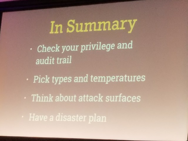
Sometimes the body of a talk is less gripping than the final slide summarizing the overall arc of the topics discussed. This one is from Devops Days Silicon Valley 2016 and pretty wells sums up the caveat emptor warnings about a the full breadth of security solutions discussed by the speaker. Notice how the image is washed out by the house lights and how some of the terms used vaguely make sense, but would be a thousand percent better in context. Sometimes, however, this is the best you can do.
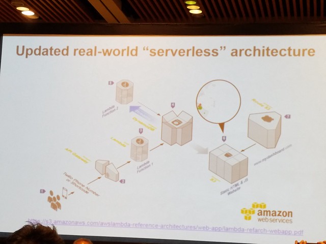
As an ops person I like these isometric diagrams of notional widgets with traffic flowing between them representing bits in the cloud, usually. This one is by no means the most elaborate of such isometric representations, and so one gets the feeling that with enough magnification and thought one might be able to reconstruct the architectural details of the solution afterwards. I have never actually found this to be the case, though. From Silicon Valley AWS Summit 2016.
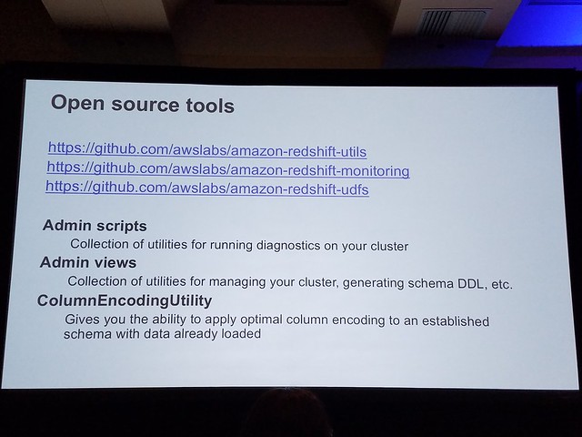
Here’s another from the Summit illustrating how sometimes it is only a few URLs one is eager to grab where the view imagines all the thought that went into the talk and more can be consumed at leisure. No need to view the entire slide deck if that’s the case, plus the repositories have the great benefit of allowing copy and paste or forking onto one’s own machine if they turn out to be gold mines.
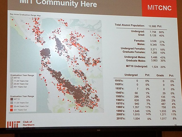
This one is not from a conference at all but an MIT alumni club meeting where I was pretty sure if I didn’t pull out my camera I’d be deprived of this impressive demographic distribution map forever. You can see the main impact crater in San Francisco and the long tail of fallout along the Peninsula where I live. Plus, there are numbers that make you scratch your head.
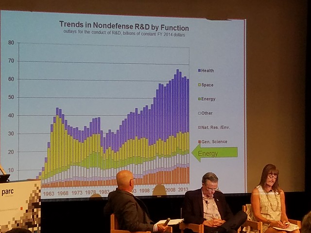
From another alumni event, here is a rare sighting of real data being brought forward to fuel a contentious political discussion (on national energy policy). I am sure I wasn’t the only one in the audience who was sad this kind of thing didn’t happen more (or at all) in the nationwide venues where political topics are flogged mercilessly.
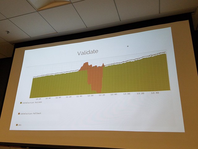
Here’s a nice minimalistic graph from a Bay Area Infracoders talk showing what happens when you run a simulated failure in live production. That’s the kind of thing every operations person enjoys seeing – the latency goes up (I guess), then the system heals itself. If only this happened all the time there wouldn’t be quite so many tears.
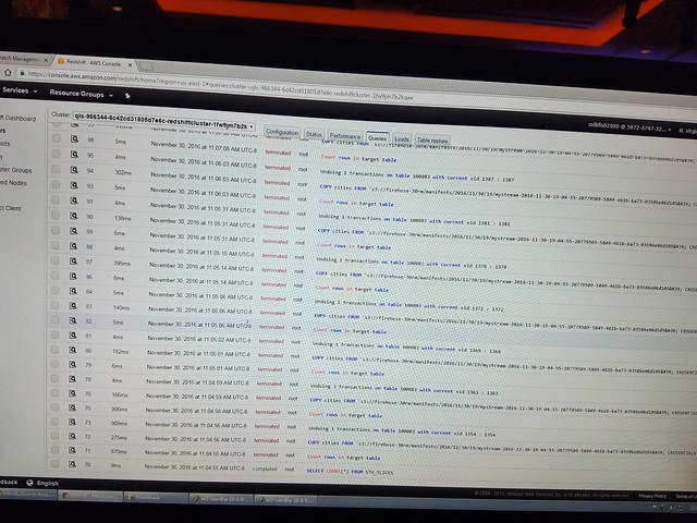
Finally, there is the live demo, which is never going to be saved for you to peruse later online. This one was at re:Invent 2016 and features a wall of illegible text as is often the case, albeit nicely colorized by Amazon. But still exciting to the intended audience.
Just last night I was at a meetup in the city where I took a bunch of great captures I’m hoping to relive soon. It’s a strange aspect of collecting which unlike the fanciers of butterflies or bottle caps will never lead the devotee to fortune, not directly, but still
comments powered by Disqus